User Guide
A complete tutorial regarding how to use GoSurvey. We have covered and explained everything related to the working of GoSurvey and its features.

How to view Cross Tab report?
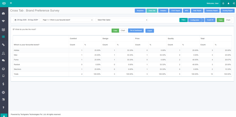
A Cross Tab report compares one question with each of the other questions in the survey. Each comparison is a table of counts and percentages. The same comparison can be shown as a chart.
The questions that can be compared are Radio Button, Radio Button with Other, Drop Down, Drop Down with Other, Check Box, Check Box with Other, Yes/No, True/False, Male/Female, Radio Grid, and Check Box Grid. A Number question is included after Include In CrossTab is checked. Expand the Number question and check Include In CrossTab. Save the questionnaire.
Step 1:
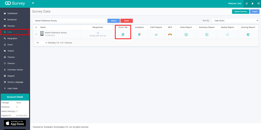
In the left menu, click Data. The page title is Survey Data.
Step 2:
In the Cross Tab column, click the report icon for the survey.
The icon can be clicked when the survey has responses. The screen title is Cross Tab, followed by the survey name.
If the survey has no question that can be compared, the screen shows: There are no questions that can be used for cross tab analysis.
Step 3: Select the question to compare.
The list opens with Please select question. Select one question. Until a question is selected, the screen shows: Please select a question to view report.

That question becomes the rows. Every other question that can be compared becomes its own table.
Select Filter Option appears when the selected question has options. Select one or more options to limit the rows to those answers.
Step 4:
Switch between the table and the chart.
Data is selected when the report opens. Each table has its own Data / Chart switch. The switch at the top right changes every table on the page.
On Chart, Chart Type is Column, Bar, Pie. Pie is selected first. Rotate appears for a pie chart. Enter a number from 0 to 360.
Click the edit icon beside a table title to change the title. Click Update to keep it, or Cancel to leave it unchanged.
If a comparison has no answers for the selected range, the table shows: No Data Available.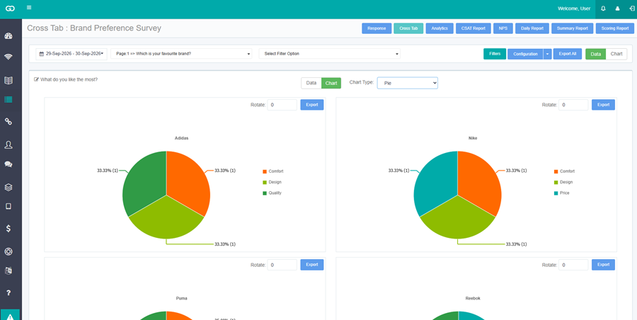
Step 5:
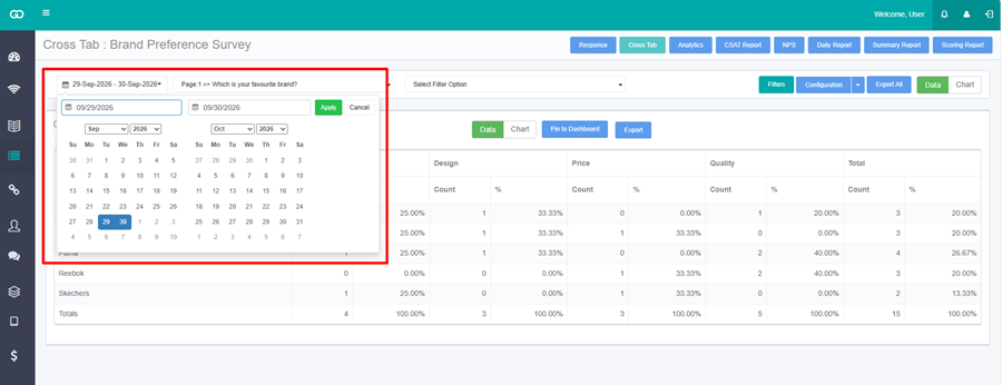
User can filter out and view specific set of data by choosing date range, filters and chart visibility
- Date Range: Select the date range for which the data has to be obtained.
- Filters: Shows the ‘Select User’ and ‘Data Filter’ which can be used to differentiate the responses, user wise and see the report on the basis of any question operator respectively.
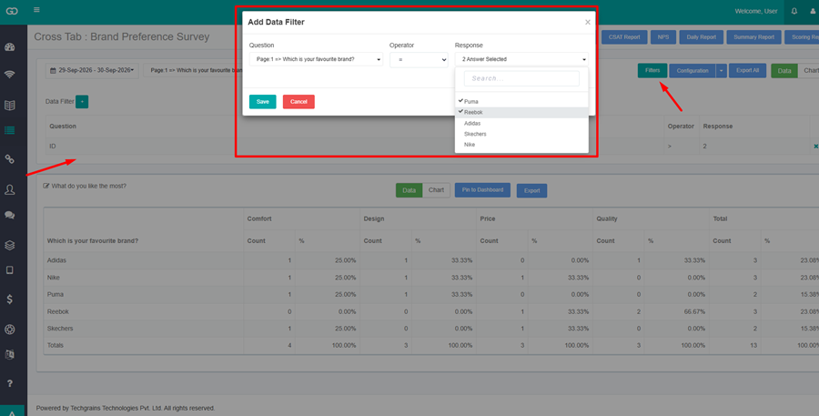
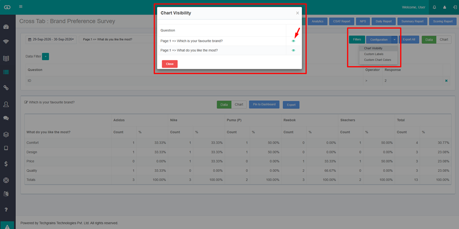
- Chart Visibility: Allows to hide selected question’s analytical charts as preferred.
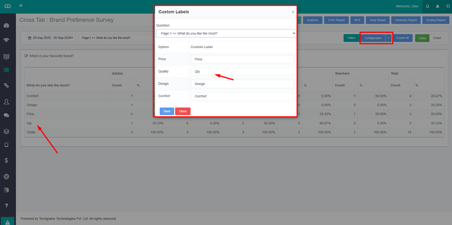
- Custom Label: changes the text shown on a chart. Select the question, enter a Custom Label for an option, and click Save.
- Export All: downloads the tables or charts currently on the page in one zip file. Tables are Excel files. Charts are image files.
Step 6:
Click on Pin to Dashboard to show the report on the Dashboard screen.
The Report Name dialog opens. Name is filled with the question text. Click Save.
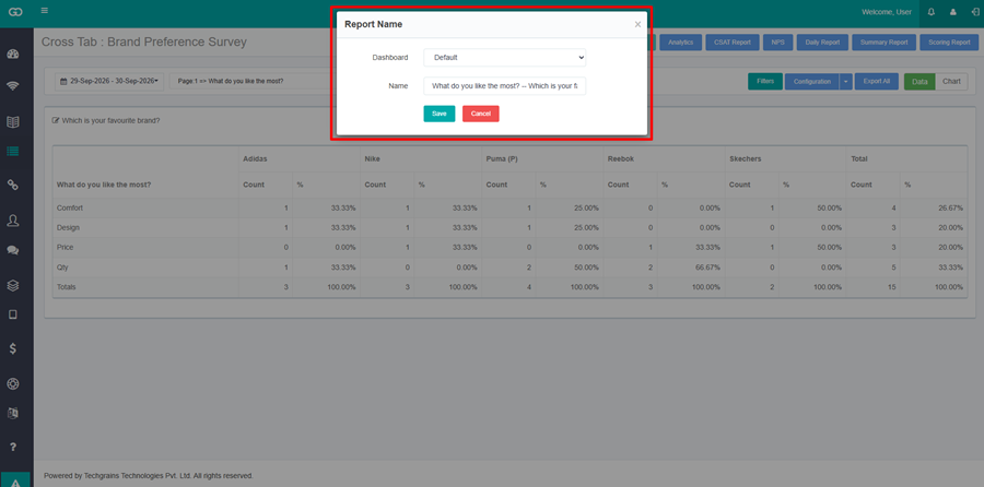
After pinning it to the dashboard it will be seen on the dashboard screen and the user can customize the date range as per requirement.