User Guide
A complete tutorial regarding how to use GoSurvey. We have covered and explained everything related to the working of GoSurvey and its features.

How to view Analytical reports?
Analytical reports can be created based on the data synchronized to the admin site. They are used to display the data in a manner that's easy to read and understand visually.
To view analytical reports, follow these steps:
Step 1: Login to GoSurvey admin site by using the same credentials that were set while creating the account. Once logged in, click on the Data menu.
Step 2: On the right-hand panel, there will be the list of surveys with their respective responses, analytics and reports.
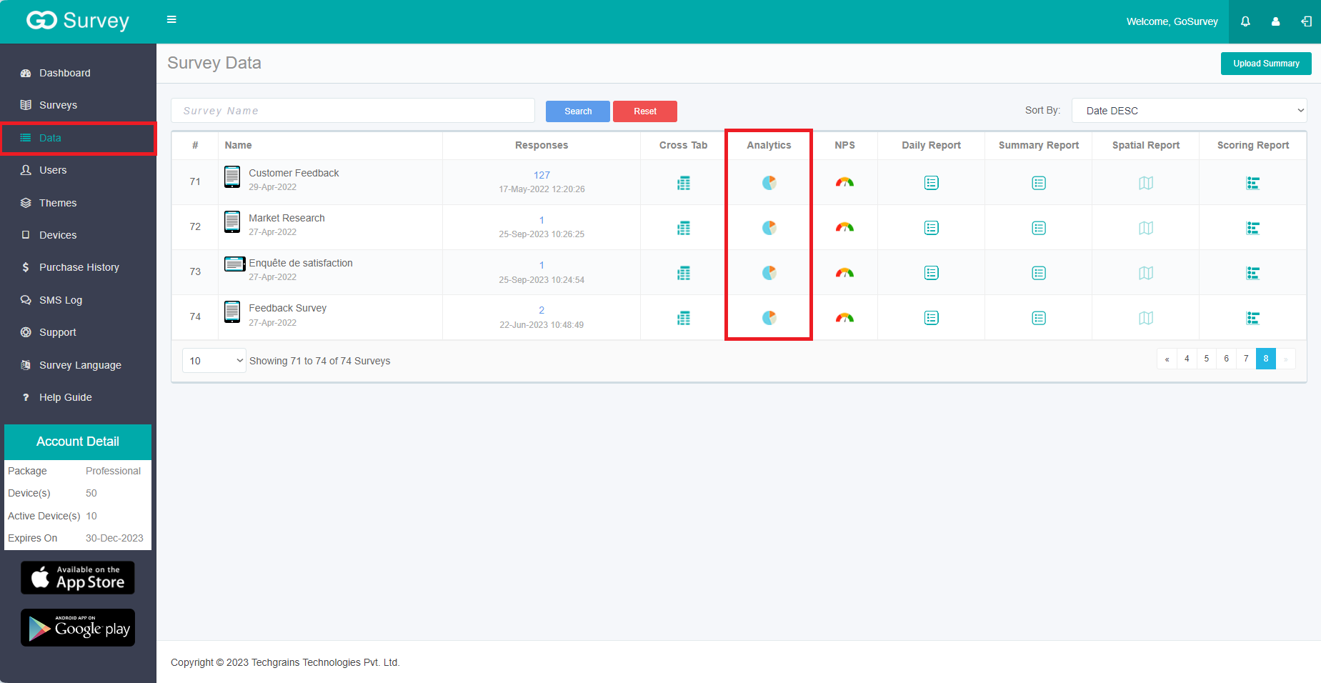
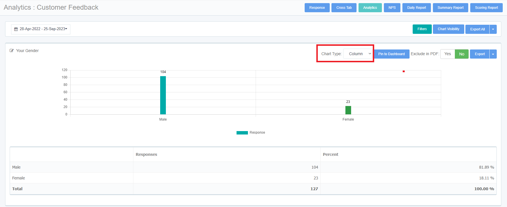
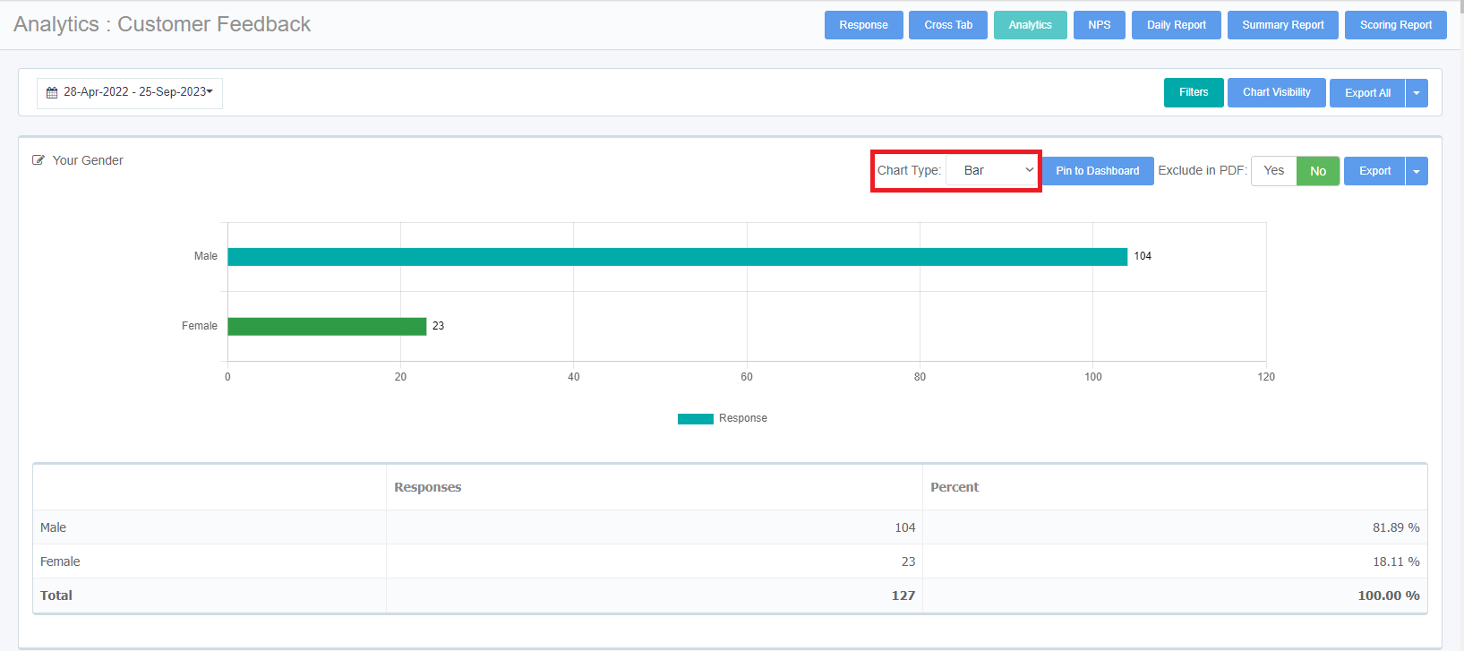
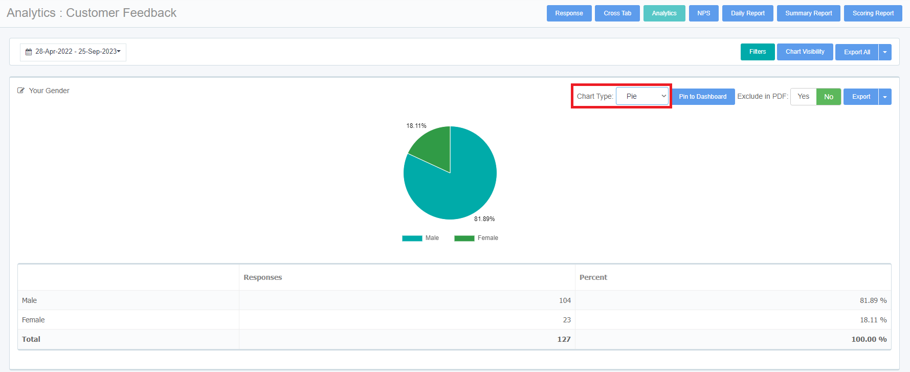
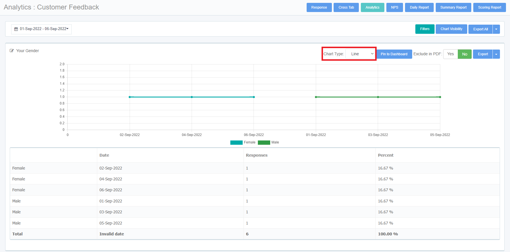
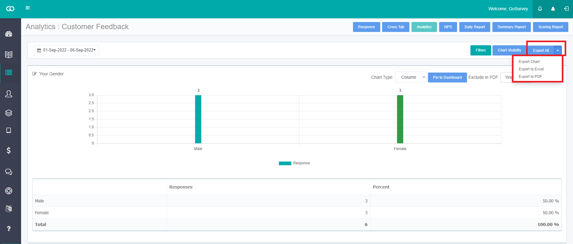
Analytics includes the analytical data of the survey responses. GoSurvey provides four different types of graphs to users for the analytical presentation of the data:
Users can change the type of report according to the requirement from the drop-down selection of Chart Type.
- Column Graph - a type of bar graph that compares data using vertical bars.
- Bar Graph - a graph that compares data using horizontal bars.
- Pie Chart - a circular statistical graphic that is divided into slices to show the relative size of the data.
- Line - a graphical display of information that displays how the value of an item changes over time.
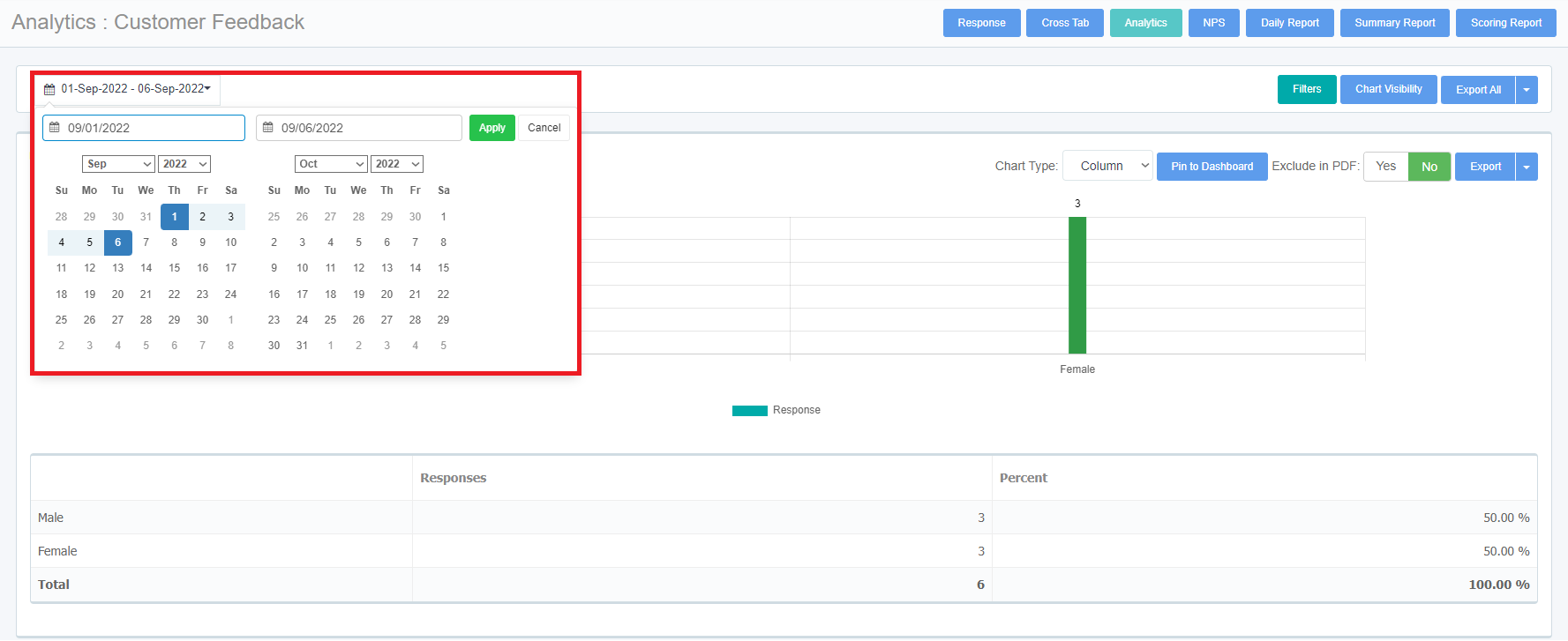
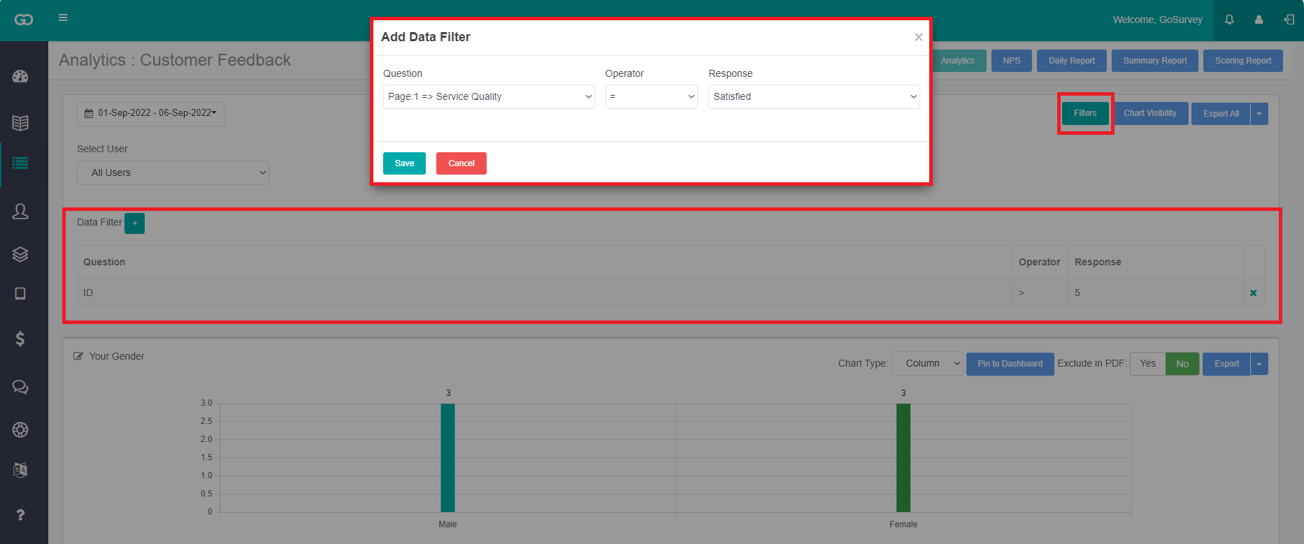
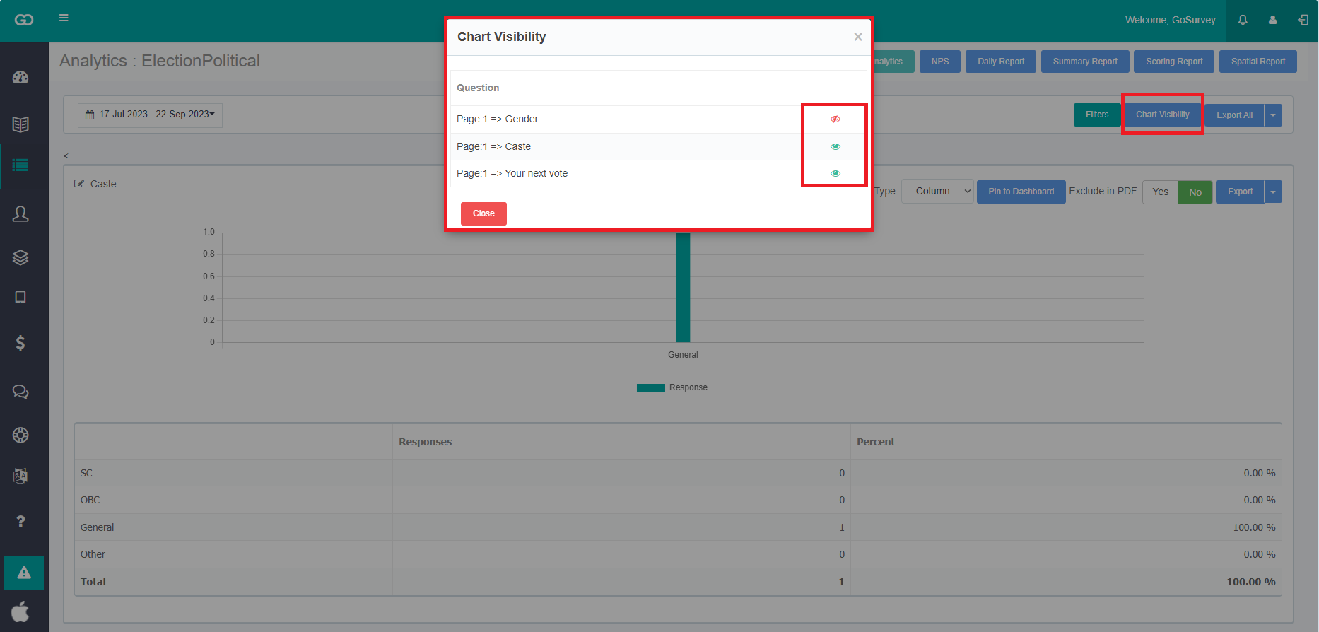
Step 3: User can filter out and view specific set of data by choosing date range, filters and chart visibility
- Date Range: Select the date range for which the data has to be obtained.
- Filters: Shows the ‘Select User’ and ‘Data Filter’ which can be used to differentiate the responses, user wise and see the report on the basis of any question operator respectively.
- Chart Visibility: Allows to hide selected question’s analytical charts as preferred.
- Export All:
Gives the option to either download all the analytics in a zip file or on clicking the dropdown, it downloads separately in a chart or Excel format zip file.
Also when surveys are assigned with filter levels, the user can filter the responses on the basis of “filters” given i.e. suppose if the user has given the filter values as state, city or area, then the user can select the specific location to get the desired data.
The report will be available on the basis of the responses collected.
Step 4: Users can also export the analytic report in PNG format by selecting ‘Export Chart’ from the Export dropdown. Once the data is generated, the user can pin the report on the dashboard.
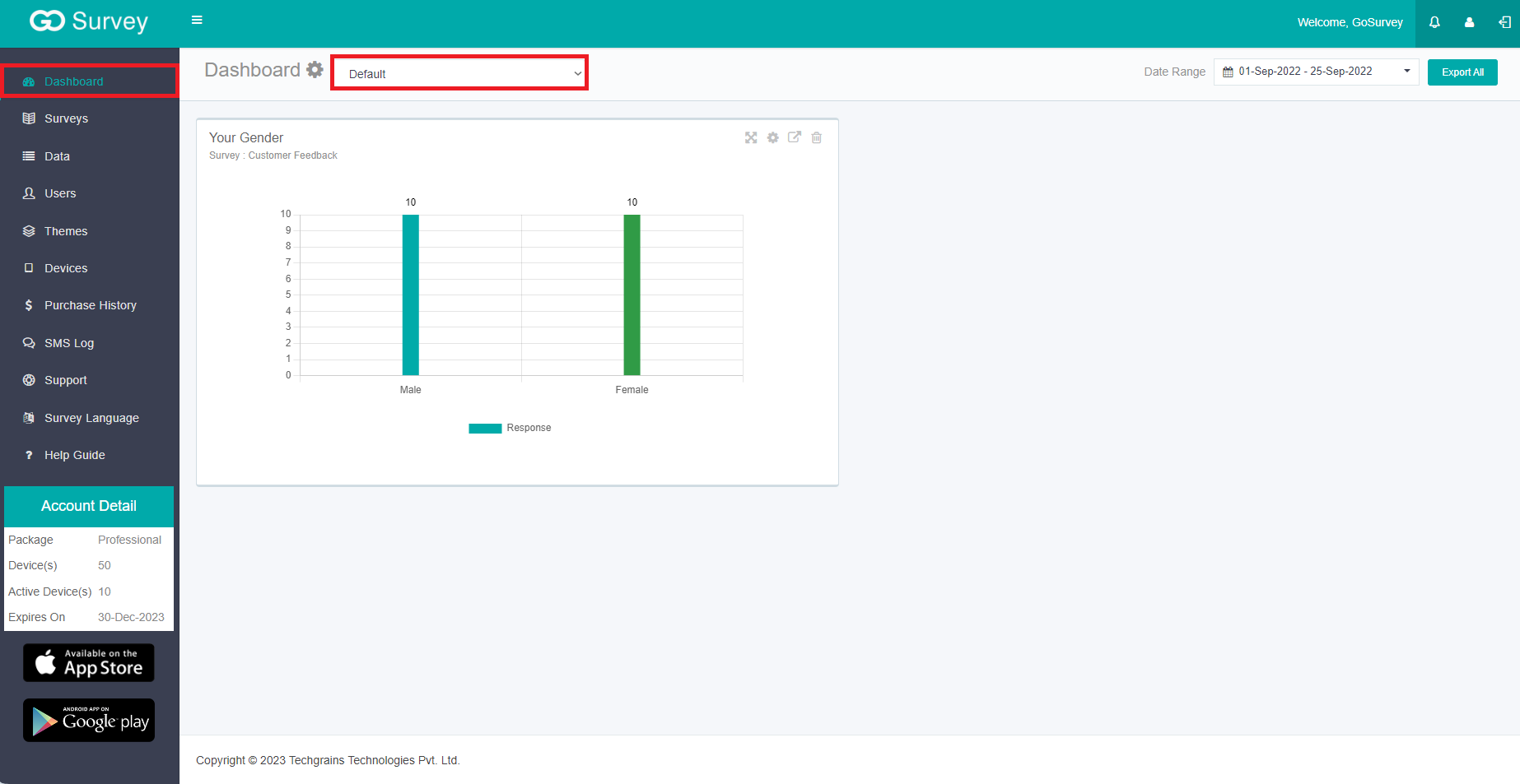
Step 5: Click on Pin to Dashboard to show the report on the Dashboard screen.
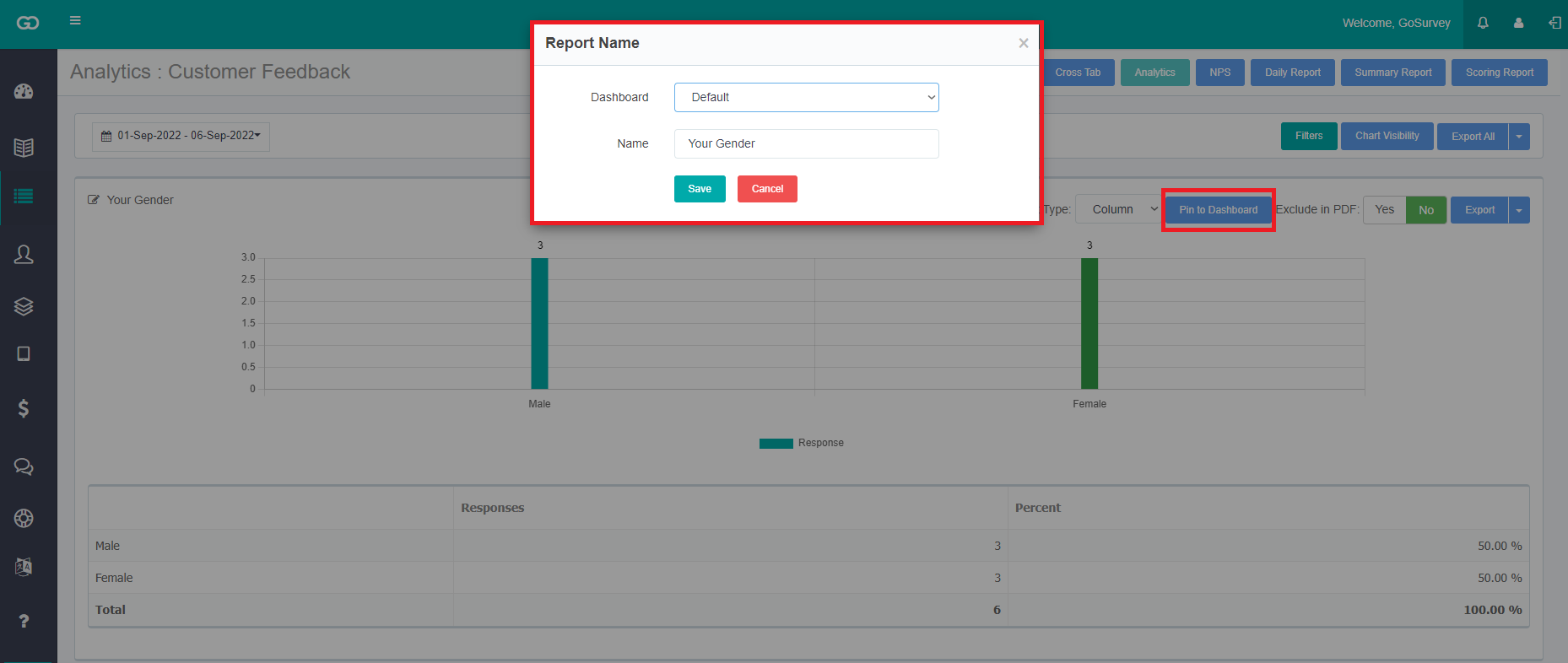
After pinning it to the dashboard it will be seen on the dashboard screen and the user can customize the date range as per requirement.
The analytical report can be created for any of the question types that are choice-based: Radio Button, Dropdown, Checkbox List, Number Point, Number with Auto Code, Rating, Yes/No, True/False, Male/Female, Net Promoter Score, Dropdown Grid, Radio Grid, NPS Grid, Checkbox Grid, Number Point Grid, CSAT, NSEC, SEC, Rural SEC, Ranking, Cascade.